Mason Neophyte
NeophyteNeophyteHello everyone, currently trying to create some dashboards for our organisation.
I'd like to be able to see peaks for certain Datasources/Resources in general but I would like to be able to display this on a dashboard or on a widget. I can't find a way to get this to work so far, has anyone got anything setup similar? How did you get this to work.
Thanks in advance.
Mason
 Professor
Kinda. The Gauge widget has a Peak option. It only applies to one datapoint/device at a time though so if you need a lot of them it's not that great. The graph widget can show min/max/ave in the legend but I'm not aware of a way to force that to always show on page load.
You can create a virtual datapoint on a graph that does domain aggregation (sum/min/max/average): https://www.logicmonitor.com/support/dashboards-and-widgets/managing-widgets/widget-configuration#Adding-Virtual-Datapoints-perform-a-calculation
The summary is over the entire timerange of the graph, so if you want to look at 30 days and see the max for each day, that's not what this does.
ProfessorDo you mind going over what you mean a bit more? Are you talking about percent/rawpercentile functions? I thought that aggregations (sum/min/max/ave) was across multiple instances/devices but not across time.
Thanks!
There is consolidation and aggregation, then there is domain aggregation:
Consolidation is where data is combined along the x-axis. For example, if your data is obtained every 1 minute, displaying that graph over 3 months would result in roughly 130,000 points along the time axis (x-axis) per instance. The consolidation function of a graph's datapoint determines how that large number of datapoints is simplified to make the graph display-able and readable. Choosing average as the consolidation means that the graphing engine will combine roughly 5 hours worth of data into a single point and graph that one point, representing the entire 5 hour timeframe.
Aggregation is where multiple instances are combined together vertically according to a function. You would do this if you wanted to know the total bytes of storage free across all instances, for example. You would enable aggregation and choose "sum" as the aggregation method. If you wanted to know the average CPU across all CPUs included in the graph (according to your filters), you would enable aggregation and choose the "average" aggregation method.
Domain aggregation is where you use a statistical formula to describe a single trend line using a single descriptor. You can create a virtual datapoint that uses domain aggregation functions. These functions take into consideration all data currently displayed, so they're calculated at runtime. While the linked page talks about complex datapoints, the percentile functions can only be used in virtual datapoints (not complex datapoints).
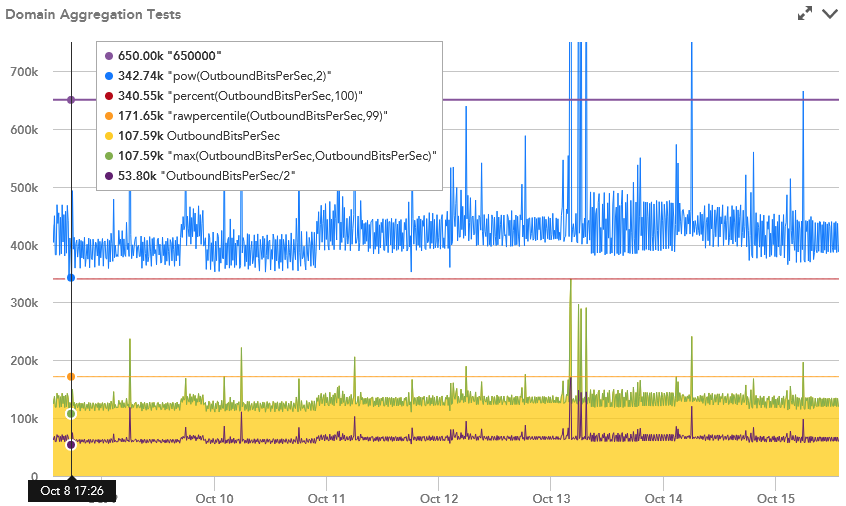
ProfessorThanks. I did some testing but the only functions that seem to work as domain aggregation, where you get a straight trend line, is percent and rawpercentile. The other functions seems to use the point-in-time value rather than all the data displayed, unless you do something that always outputs the same value regardless of the datapoint value, like just providing a static number. Cool that you can use something like percent(datapoint,100) and percent(datapoint,0) to get the max and min of the graph shown though!
Thanks!
Yes, there is some work that needs to be done here. Likely the UIv4 transition will completely change things. "pow" is expected because you're only taking the current value and raising it to a power. Similar to other simpler arithmetic functions like a + b.
Yes, percent(0) and percent(100) are the easiest, although not most intuitive ways of getting the max and min on the graph as flat lines.
You could also query the API, to retrieve the data, and return only the largest value.