Forum Discussion
- AustinC
Neophyte
I would use the focus button all the time in UIv3 (mostly because that was the only way to get access to certain functions), but the new UIv4 layout makes me intuit that this focus function may be outmoded.
If the button remains, I will echo
@Michael Raymond ‘s feedback, that ensuring that this button is always in the same place in a given column would be far more attractive. - mray
LM Conqueror
I often do focus in on things, but I prefer the static positioning of the focus button/icon more like it is in the legacy UI. I will often misclick on it when trying to select something from the resource tree which throws off my workflow.
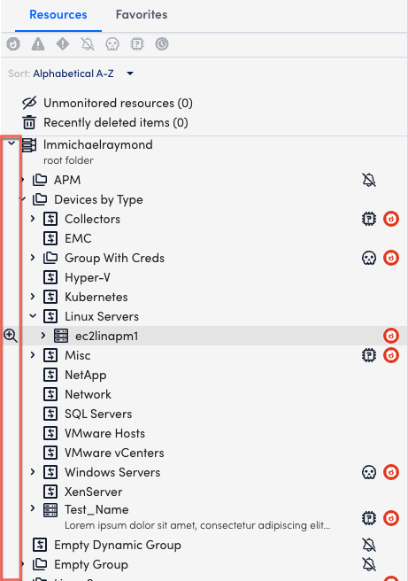
If we don’t want to do a fixed position, like the old UI, and we really want to go with an on-hover icon that follows the cursor, then my suggestion is to have it show all the way on the left-hand side:

This serves the same function, but is more out of the way.
- pgordon
Advisor
99.9% of the time no. The automatic zoom in or “focusing” is extremely distracting overall and I lose my place in my work when it happens every time
Related Content
- 4 months ago
- 11 months agoAnonymous
- 2 months ago
- 3 months ago
Recent Discussions
- 5 months agoAnonymous
