Forum Discussion
mray LM Conqueror
1 year ago LM Conqueror
I often do focus in on things, but I prefer the static positioning of the focus button/icon more like it is in the legacy UI. I will often misclick on it when trying to select something from the resource tree which throws off my workflow.
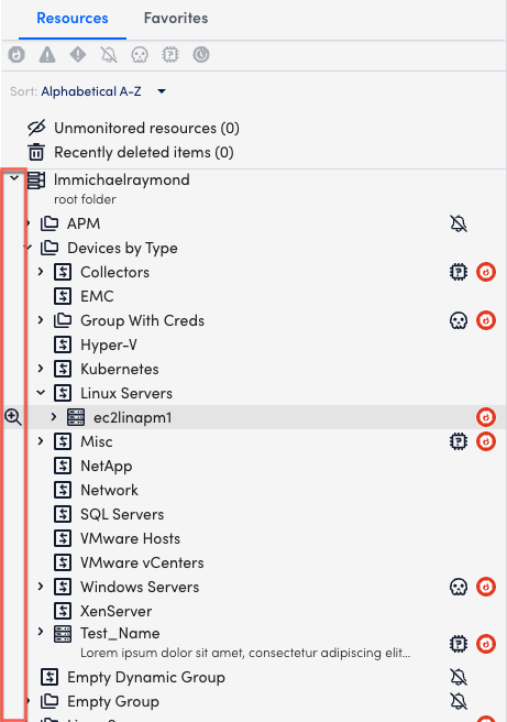
If we don’t want to do a fixed position, like the old UI, and we really want to go with an on-hover icon that follows the cursor, then my suggestion is to have it show all the way on the left-hand side:

This serves the same function, but is more out of the way.
Recent Discussions
- 1 year agoAnonymous