Forum Discussion

DanB's avatar
DanB
Icon for Advisor rankAdvisor
5 years ago

Is there a way to disable the auto-expanding of resources clicked on

Is there a way to disable the LM GUI from auto-expanding the device when you click on it. I hate this behavior.

I want to just go thru the full list of devices in a group 1x1 but when I click on them, it auto expands the device showing all metrics its collecting. I have to then close that device and then scroll down to the next device and repeat. How do you stop this behavior?


  • I would love to see this change as well

    Is it more beneficial to comment here or to have each interested person submit their own feature request?

    There are benefits to both; commenting in our community forums helps generate discussion and interest in certain features or functionality, whereas submitting a feature request through your portal creates a ticket for review by our product managers and various stakeholders. Though we do our best to review and consider discussions in our community, the latter approach is the best method for us to track requests.

  • Hi Mike. I disagree. Why does the GUI no behaving like 99% of the rest of the programs out there.

    If you click on the device it should just display its contents in the details side. If you click on the ">" arrow next to the device name then expand the device to show its sub-contents. 

    This should be a toggle switch setting in your user specific profile. I'll open a feature request then on this.


  • HI Dan, 

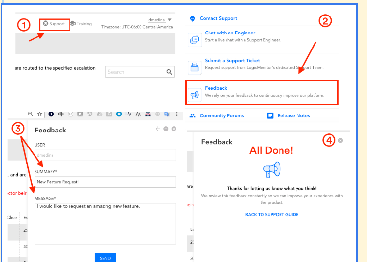
    You are correct in that this type of feature is not implemented and best left as a feature request. If you an attach your workflow to the request that would also help expedite it. Here’s a quick  screenshot on how to submit a feature request just in case: 


  • I 100% agree with Dan.  I find this very very very very (you get the point) annoying to have this auto expand.  There are times I need to click through the various resources and check settings on them all and for it to expand that I either have to scroll past, or have to compress to go to the next asset is very annoying.

  • I would love to see this change as well

    Is it more beneficial to comment here or to have each interested person submit their own feature request?

  • I would love to see this change as well

    Is it more beneficial to comment here or to have each interested person submit their own feature request?

    There are benefits to both; commenting in our community forums helps generate discussion and interest in certain features or functionality, whereas submitting a feature request through your portal creates a ticket for review by our product managers and various stakeholders. Though we do our best to review and consider discussions in our community, the latter approach is the best method for us to track requests.

    Alrighty, thank you!

  • None that I know of, I typically do want to auto-open. Perhaps some browser javascript modifier plugin that can block onClick events? No idea. Typically when I need to go down a list of items manually that auto-open I would start from the bottom and work my way up. So that even if it opens it doesn't get in the way from clicking on the one above it. Also if manually going thru a list of devices is a frequent thing, you might want to look into using/learning the API and automating the work.

  • Anonymous's avatar
    Anonymous

    I would start from the bottom and work my way up

    This is what I do when i don’t want them auto expanded.

    This should be a toggle switch setting in your user specific profile. I'll open a feature request then on this.

    100% agree. If we had voting on feature requests, this one would get my vote.