Forum Discussion

Anonymous's avatar
Anonymous
3 years ago

First impressions of the new exchange, now known as "My Module Toolbox"

?‍♂️I still don't know which and how many modules are out of date and need action.

I can't get the numbers to agree with what I see using the traditional update tool. Here's what I show as the update counts (the DS category also includes ConfigSources):
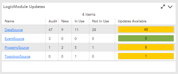
Yet, I can't get any combination of filters in the new exchange to resemble any of these numbers. How do I show all modules that are new (so i can bulk import them)? How do i show all modules that are updated, in use, and not audited? Where are the affordances? Where are the signifiers? Seriously, people have been using app stores for years now, yet the exchange still doesn't just have a way of "update all"? Or even just "show me my updates"?

  • Anonymous's avatar
    Anonymous

    And what is up with the status column? What do the icons mean? They're not intuitive. And why, when there are 4 icons to shove into that column do you not just make the column wider? Instead, you take the third and fourth icons and hide them behind a hamburger icon? Someone is valuing form over function.

  • Hey @Stuart Weenig, you should be able to see all updatable modules with the filter set shown in the attached image. You'll have a hard time filtering out audited modules until we update the Skipped Update filter. There is no way to filter on "in use" or "not in use", and in the Import From Repository interface, this was misleading, as it only looked at whether appliesTo returned 1 or more devices. It didn't look to see if instances were found or data was actually being collected.

    If you mouse-over the icons it will show you the text labels for them.

  • Anonymous's avatar
    Anonymous

    We should have another chat.

  • Anonymous's avatar
    Anonymous

    The skipped updates filter tab is rough. Why is it different than the others? Seems like it could easily be similar to the status filter. As is, it uses a double negative, which is confusing.

    On 12/2/2022 at 1:25 PM, Michael Rodrigues said:

    If you mouse-over the icons it will show you the text labels for them.

    That part is clear enough. I'm talking about the actual status column where anywhere between 1-4 icons appear. Problem is if there are 4 icons, it hides the last two under a hamburger icon, even if i widen the column. LM has spent years putting DSs into the "ungrouped" group to avoid one extra click. But now, I have to click just to see the options that are available. Just add another 40px to the width of that column so all 4 icons fit.

  • Anonymous's avatar
    Anonymous

    Webinar Thursday about this.

    Took another look: where are the diffs?

    Also, with the filter customized==No && status==outdated, it shows 7 logicmodules:

    Clicking on the row gives the details (no diffs yet). One of the buttons there (pencil) gives the option of going to the currently installed version of the logicmodule. However, that version is the same as the version the toolbox wants me to upgrade to:

    Plus, when i run updates the old way (repository) those logicmodule doesn't show up as needing an update.

  • Anonymous's avatar
    Anonymous

    I did not customize the Zookeeper- DS, even though the toolbox thinks I did. I have audited 58 logicmodules. However, the toolbox shows a total of 57, quite a few of which are not audited.