Forum Discussion

faran's avatar
faran
Icon for Product Manager rankProduct Manager
2 years ago

Dashboards UIv4 is available starting August 23!

We're thrilled to announce an update to enhance your dashboard user experience. With this UIv4 update, we’re introducing an intuitive new design that aligns with the new LM experience, making your dashboard navigation more seamless with other areas of the product. Update the toggle on the top navigation to ‘New UI Preview’ to see the following changes.

What's New:

🎨 Revamped User Experience: Our team has been hard at work reimagining the dashboard's visual appeal. With a new skin, your dashboards are now in line with the rest of the UIv4 changes that you’ve become accustomed to. While the core functionality remains intact, new aesthetics that consistency across the platform improve the quality of our LM experience.

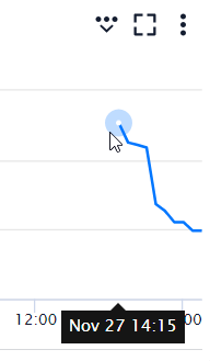
🛠️ Enhanced Widget Editing: We've heard your feedback, and we're excited to introduce a new capability to the dashboard widget editing process. Say goodbye to the hassle of publishing a widget to witness changes – you can now preview your modifications in real-time before hitting that publish button. This means you have the power to experiment, tweak, and fine-tune your creations with the confidence of knowing exactly how they'll appear to your dashboard consumers.

Thank you for being a part of our beta community. Your insights and feedback have been invaluable in shaping these new changes. We take pride in helping guide our analytics journey and want to get you to your destination in style.

 As always, your feedback is essential to us, so please don't hesitate to share your thoughts and experiences as you dive into these exciting new features.

Stay tuned for more updates, and happy dashboarding!

Best regards,

Faran - Senior Product Manager for Dashboards and Reporting

  • Anonymous's avatar
    Anonymous

    Editing a widget, uses vertical space, but not all of it. In this day and age, monitors are wider, not taller. I would rather have the screen split vertically instead of horizontally. Also there is no way to know which widget I am editing. I would prefer either the current widget somehow has a backlight on it or the editing box doesn’t show the dashboard and instead shows a single copy of the widget we are editing.

    You can move the widget editor to the right side, the bottom, or pop it out into a modal. This is similar to how dev tools works in chromium based browsers. I do wish some icons could be used though:

    Agree that most UI developers think about either tall mobile devices or wide screens. CSS was built years ago to account for this, automatically adjusting to entirely different layout options given the width of the screen. Unfortunately, I don’t think LM CSS’d the UI, it probably came from a framework that they still don’t have much control over.

    I never noticed that it doesn’t signify which widget is being edited. That’s a big problem. The only indicator is the title in the editor. Even making changes and hitting preview doesn’t actually re-scroll to show the modified widget. If I start editing a widget, scroll down on the dashboard, then hit preview, I still don’t see any of my changes because I’d have to scroll back up. I like the idea of highlighting it on the page somehow. Like marching ants or something (is that too 90’s? New UIs don’t have to look new).

  • Anonymous's avatar
    Anonymous

    Does anyone know if there’s a way to force fullscreen either for a dashboard or a specific widget on load?

    You know what? If the widgets on the resource tabs were made into actual widgets and we had the ability to tell them to load full width, the resources and dashboards pages could be consolidated into a single UI.