Forum Discussion

Stuart_Weenig's avatar
2 years ago

What's the distinction between groups and categories

Maybe I just don’t get it, but I don’t get the distinction between the two. One is a place to put certain posts and the other is a place to put certain posts.

Maybe i’m too old school, but i miss the basic listing of all the places where posts could live. So far, the home page is unusable for me. All the navigation is too complex. So far, I’ve only been responding to email notifications. Anything on the home page that is remotely interesting is below the fold. Didn’t even realize it was there until later. Unless the home page and navigation get better, my interaction with the community will be less with the new system. On the old system, browsing was a lot easier and it would keep track of posts that i’d read and posts i hadn’t. So I was able to make sure I didn’t miss anything.  I have no idea if i’m missing things.

7 Replies

  • A11ey's avatar
    A11ey
    Icon for Community Manager rankCommunity Manager

    Appreciate the feedback Stuart! 

    The reason for groups is typically for allowing only specific people to have access, customers vs all others, private vs public, etc.  Since this community allows. anyone to join, we will have members that are not customers, but we may have specific information, that is for customers only, we aren’t quite there yet so yes, agree we need to better define and determine what needs to be a group vs a forum.

    An example the Customer Feedback group, will eventually become private after soft launch, by invitation only, we will reserve this group for more engaged/tenured community members to provide feedback.

    As far as the homepage, this is great feedback, we are trying to balance the elements for tenured Community users and new Community users, a little something for everyone.  I’d be interested to know from both tenured and new users, if after the initial launch, would continue to access the community via homepage, or if you typically would go directly to a specific forum? Most communities  (ie, Microsoft, Cisco, Gong, etc) have a landing page that brings multiple elements of the community to the forefront. We can move some of the elements around and make others more visible, but we want to balance that for new users as well. So what are the most important elements for tenured users vs new users?

    We’ll be reviewing all suggestions and making changes based on feedback!

  • I miss the quoting ability of the old community.

    An example the Customer Feedback group, will eventually become private after soft launch, by invitation only, we will reserve this group for more engaged/tenured community members to provide feedback.

    Why do this, especially when you say you want feedback from tenured and non-tenured members? 

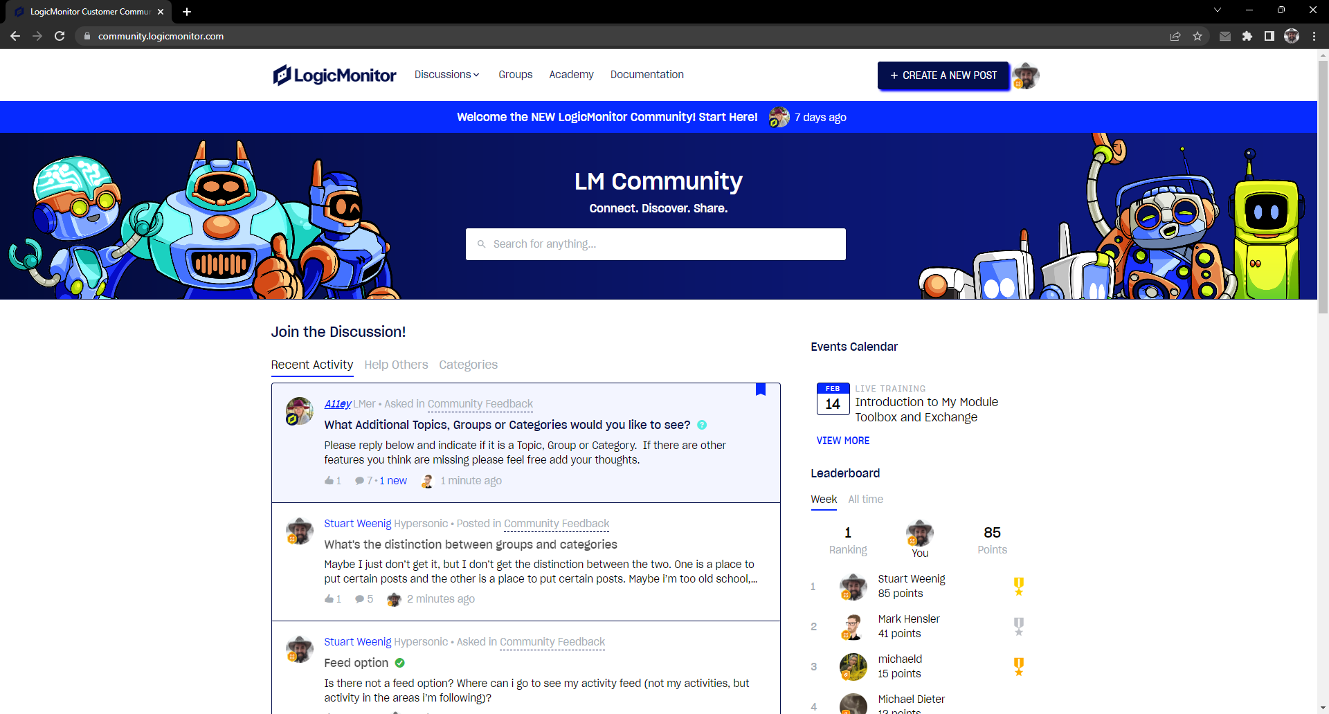
    For me, I would like the home page to show my unread feed (#1 thing missing so far). Since it seems that this community can’t do unread feed (boo), the home page might not be useful at all for me. So maybe my feedback isn’t as important as others’ since I might not end up using the home page at all and only relying on email notifications (boo). Email notifications require me to subscribe, so I’ll probably miss stuff.

    The blue banner will eventually go away, so that will help not push stuff below the fold. The search bar could really be on the same line as the counts, it doesn’t need to be on its own huge background image tile. However, the counts aren’t interesting to me; they could be in the footer since they are really just a performance indicator to LM, individuals won’t really be interested in that. Maybe they’d be interested in knowing that the community is active and not stale. But that is better shown in the activity feed.

    The “welcome to lm community”, “lm tech talk”, “product hub” and other blocks are unclear. Are those links to posts? Are those the categories? How are they different than the LM spotlight? Do the LM Spotlight cards point to posts? Honestly, the only thing above the “Join the discussion” section, except for the search and the main header bar, is uninteresting to me.

    At the very least, I’d like to see cards or something just representing the top level categories and the top level groups, with distinctions between groups and categories.

  • The “welcome to lm community”, “lm tech talk”, “product hub” and other blocks are unclear. Are those links to posts? Are those the categories? How are they different than the LM spotlight? Do the LM Spotlight cards point to posts? Honestly, the only thing above the “Join the discussion” section, except for the search and the main header bar, is uninteresting to me.

    Ditto!

    I have ignored everything above the “Join the discussion” heading.

    I tried to find a way to navigate to the “Community Feedback”, which I thought was a category. I noticed that it was a group. But it was still a bit later before I noticed the “Groups” link at the very tippy top of the page -- in the Ignored Zone.

    It seems that Groups function nearly identically to Categories with the exception that you can restrict access. Is there really a need to distinguish between the two? Even the URLs are constructed identically! Why not list the groups along with the categories?

  • Actually, with the old community, there were groups, but they were only used for permissions on categories. So it was used to restrict access.

    Yes, please take away the distinction. Use groups for permissions, but list all the categories I have access to on the main page.

  • I’m another old school forum junkie having hosted, moderated or just participated on various ones since the 90s and my preference is that classic phpBB style layout where subforums are grouped together by broad areas such as Networking, Servers, Cloud, Misc.  I’ve also never really utilized the frontpage of any forum except for initial registration preferring to bookmark and go directly to the listing of all subforums.

  • Getting more familiar with the home page. It seems there are 6 static featured links and 3 dynamic items in the spotlight. Get rid of one of these. Looking at them now, they appear to me to be just ads. Maybe if they had an option to dismiss them if I’m not interested in them. Or the option for me to collapse the section for my view until I uncollapse them.

    Musings: wonder if i could just use my ad blocker to hide them...