Forum Discussion

JbezFL's avatar
4 years ago

General Monitoring/Dashboards

HI all,

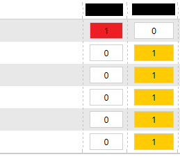
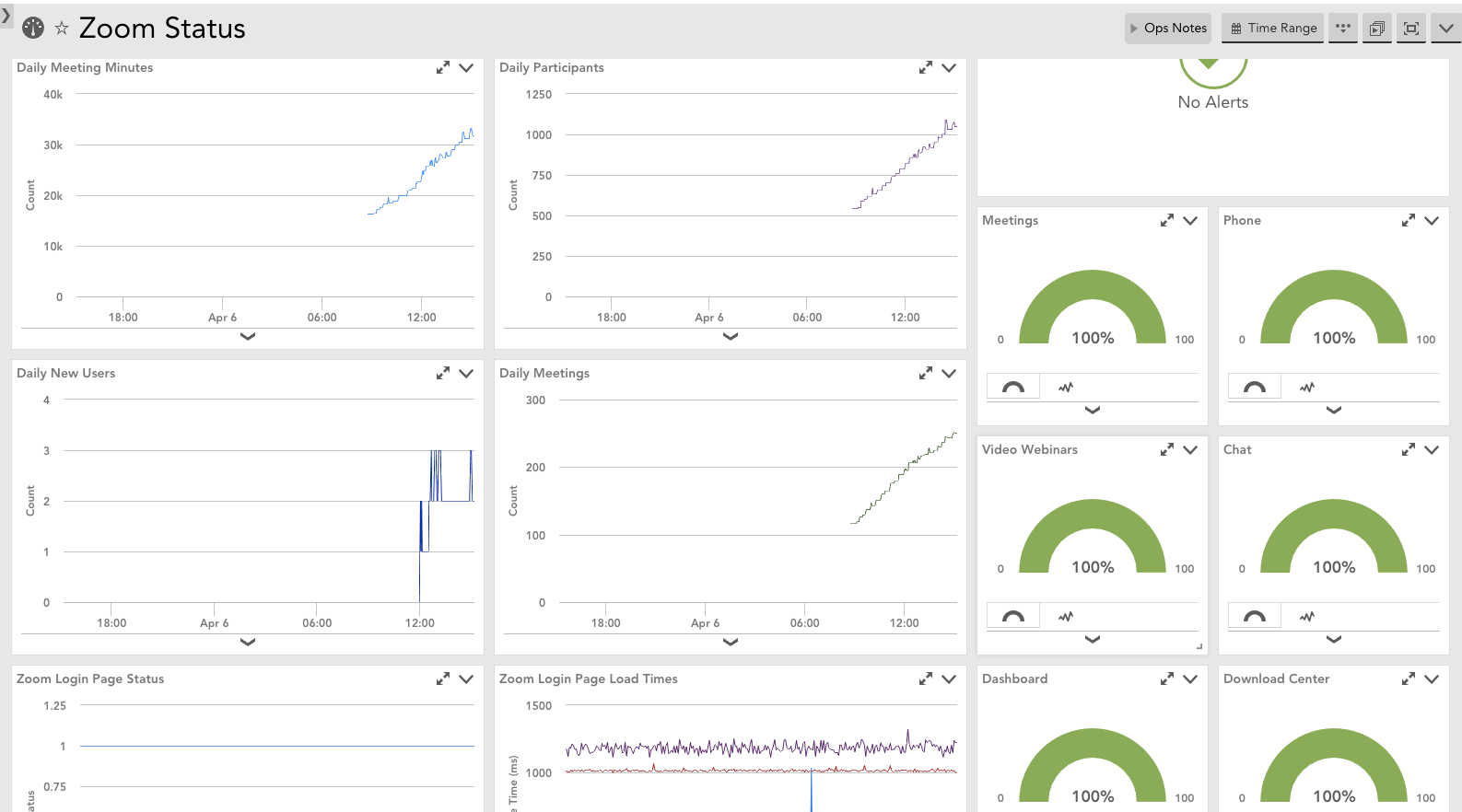
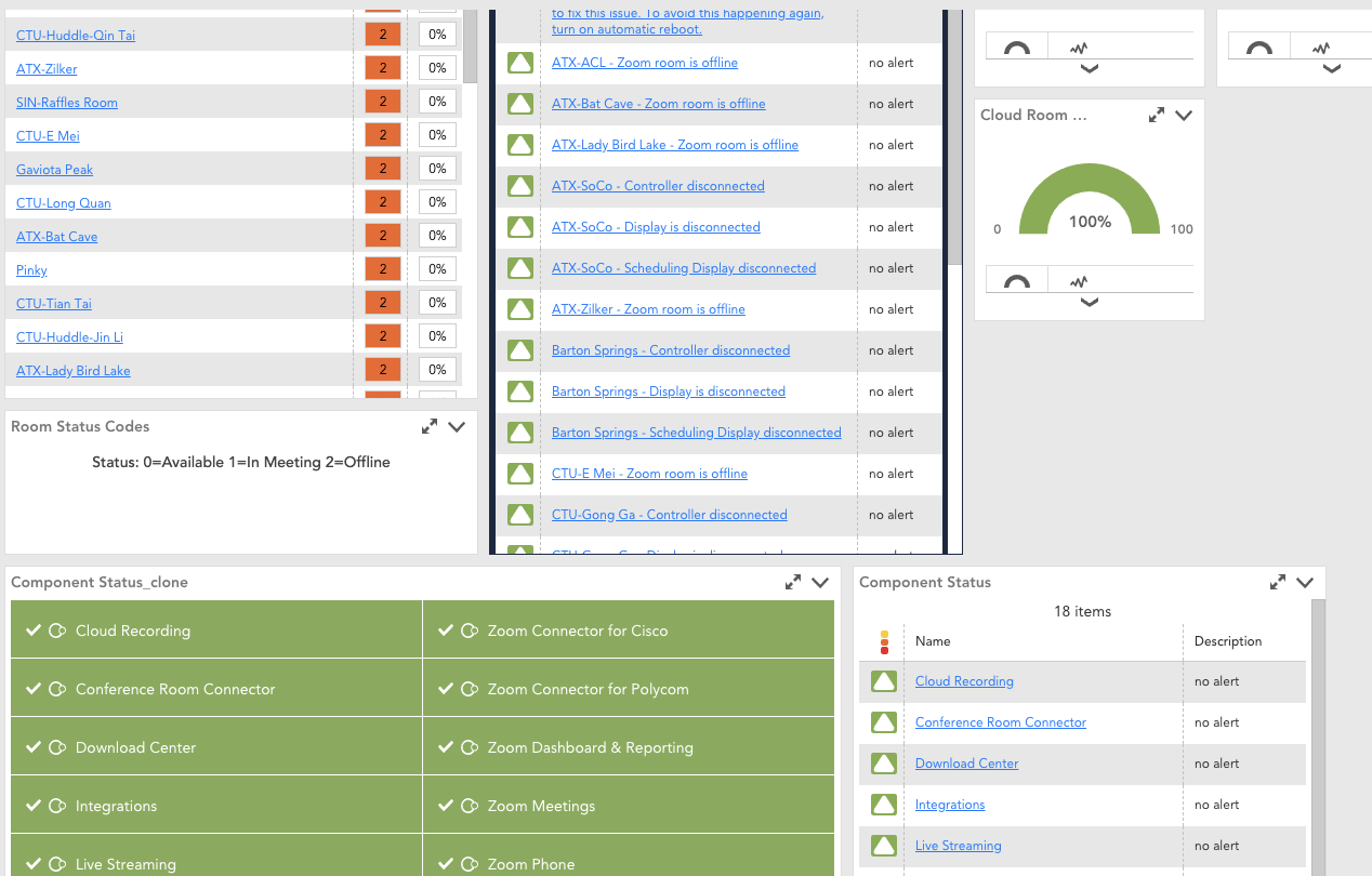
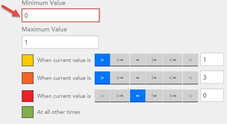
I've created some really nice dashboards but I would really like a simple State dashboard. I want a widget that simply shows me Up/Down for services or basic vm connectivity. If my server state = 0 or if a service stops (so state goes from 1/true or 0/False). Can anyone recommend something clean. I dont want is a NOC widget or anything, just a simple quick look to see if something is down or stopped. 


Any help is appreciated. Stay safe during this crazy time. 

9 Replies

  • NOC widget is likely your best bet but for situations where I don't want to rely on an alert, I've used the (dynamic) table widget with State column but also use Color bars to simulate a NOC-like widget. For example you can have a State column where 0=OK and 1=BAD, have the color bars set like this: Min: 0, Max:1, Red >= 1. So when the state goes to 1 it will turn the cell red.

    There are some limits to this though. Like that you can only have 2 color bar columns and tables always sort by 1st column only.

  • Anonymous's avatar
    Anonymous

    I built a Zoom dashboard that shows the status of each item as a gauge. It's highly manual, but it's very quick and easy to see what's up/down:

    Essentially, you'd manually add a gauge widget for each object you want to monitor and do an expression on the datapoint to convert 1/true/up/on to 100% and 0/false/down/off to 0%. You'd set the gauge to change color based on thresholds. Essentially, you would set it to red for ==0 and it would be green otherwise.

    I could see an enterprising person exporting the json for the dashboard and generating the necessary components using a script, but I haven't gotten around to needing that yet.

    Not sure what you have against the NOC widget, because it's the hammer for this nail. If it's a case of not being able to get it to do what you want, what difficulties are you hitting?

  • This is super helpful. Still not sure there isn't a basic Dashboard for ping/state/variable = 0/null/false whatever with Yes/No or even a happy face/frowny face lol. 


    Thanks guys, ill probably take from both of these answers. 

  • Anonymous's avatar
    Anonymous

    ^^Really great idea. Did exactly that on another part of the same dashboard:

  •  

    On 4/6/2020 at 1:19 PM, Mike Moniz said:

    NOC widget is likely your best bet but for situations where I don't want to rely on an alert, I've used the (dynamic) table widget with State column but also use Color bars to simulate a NOC-like widget. For example you can have a State column where 0=OK and 1=BAD, have the color bars set like this: Min: 0, Max:1, Red >= 1. So when the state goes to 1 it will turn the cell red.

    There are some limits to this though. Like that you can only have 2 color bar columns and tables always sort by 1st column only.


    I had this kind of issue and I add to change the Minimum Value from 0 to -100 and the colors came fine...

  • Has anyone worked with this same idea but done it over a time period?  I.e. multiple rows showing status of each of the monitored groups but each column is a different day / time period?  I like the look of the NOC widget but wish I could choose a time frame for it.

  • Has anyone worked with this same idea but done it over a time period?  I.e. multiple rows showing status of each of the monitored groups but each column is a different day / time period?  I like the look of the NOC widget but wish I could choose a time frame for it.

    The closest you could get would be a separate widget with different default times for each widget. One widget will only use one timeframe for the whole widget. 

  • That’s what I was worried about, since I can’t set the default time frame to be a specific time frame (i.e. two days ago instead of past two days).  I thought about using an alert graph to get number of alarms but that appears to only be on the entire portal and not something you could break apart by resource group.

  • The alert graph, like the header graph on the alerts page? Yes, that can be broken down by various dimensions (and filtered). Didn’t realize it was available as a dashboard widget though. It most likely will be available in UIv4.