Forum Discussion

Anonymous's avatar
Anonymous
2 years ago

Parity? What is that?

So, this is happening at some point.

Today, given the release of several updates to modules, I decided to abandon my really good workflow and the coolest tool LM never built in favor of the modules toolbox. Sigh.

  1. There’s no option that I can find to “show associated devices”, which in the old UI showed a list of devices with their associated instances. You could even filter to only show those devices that had instances. There was a CSV download option. It was great because you could tell the difference between a module applying to 500 devices that have instances and applying to 500 devices that didn’t have any instances. It’s the difference between impact and no impact.
  2. Later, I needed to clone at propertysource. The existing one was fine, just needed to add some stuff for a different purpose. Guess what there is no button for in the module toolbox? Cloning a module.

On the plus side, there is now a “use status” column for display and filtering. That helps a ton. 

This isn’t a parity issue, but there’s a new “deprecated” indicator for those modules that have been deprecated. You know what you can’t find without going somewhere else? Which module replaces it.

I really, really hope the old ship doesn’t get scuttled before the new ship can even float.

  • Hey @Stuart Weenig , both of these functions are still in the Toolbox.

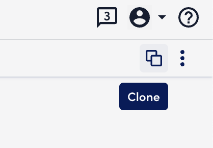
    The clone button is the icon in the top right that shows two squares with one behind the other.


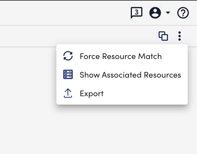
    “Show associated devices” is now “Show Associated Resources” and is in that 3-dot menu just to the right of the clone button. There is no CSV export but I’m pretty sure this was never in UIv3 either:


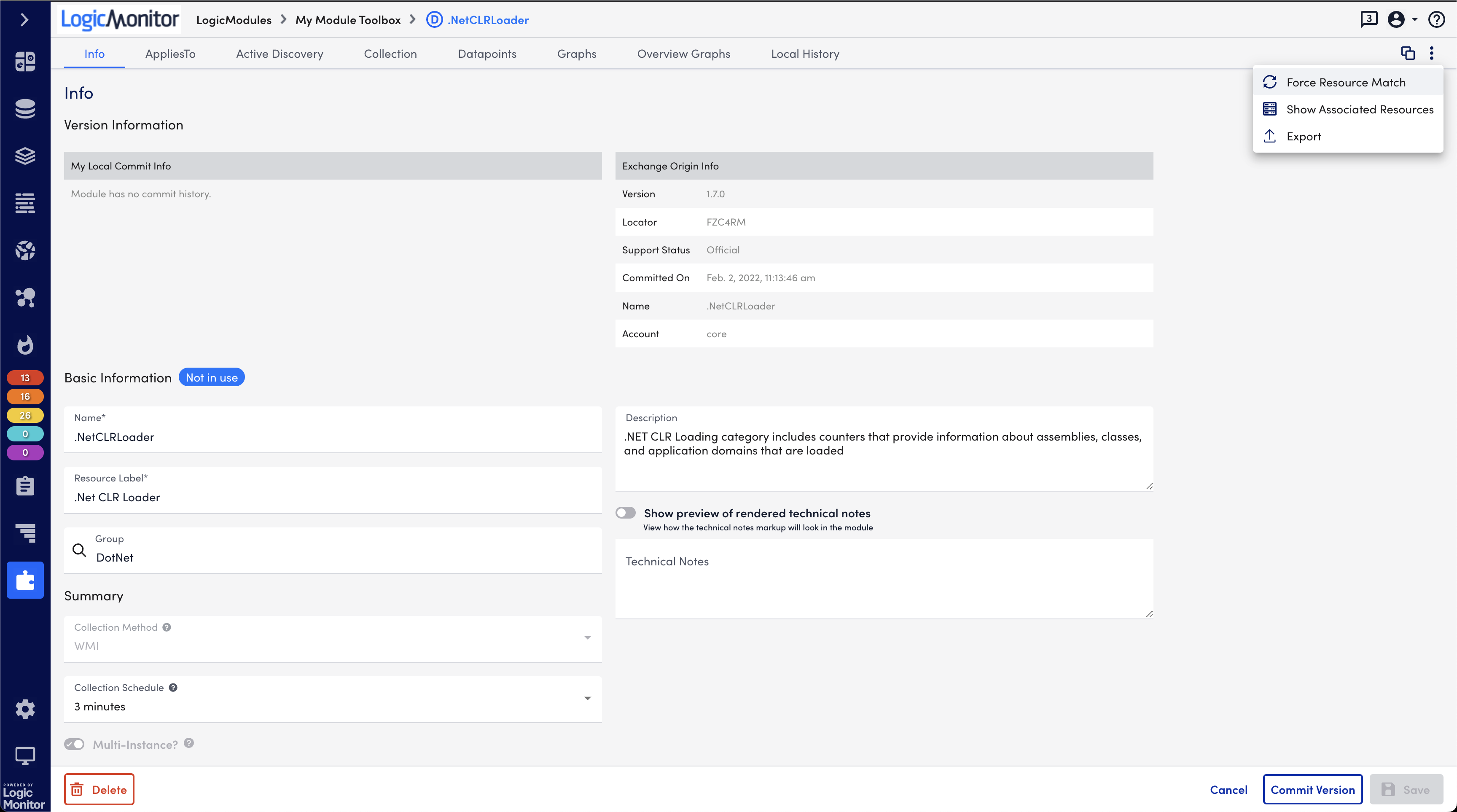
    Here’s a wider view for orientation:


    We know users want better direction on what replaces a deprecated module. I think we’ll get there (this info is generally in the release notes already), but we want to make sure parity and major functionality is solid first.

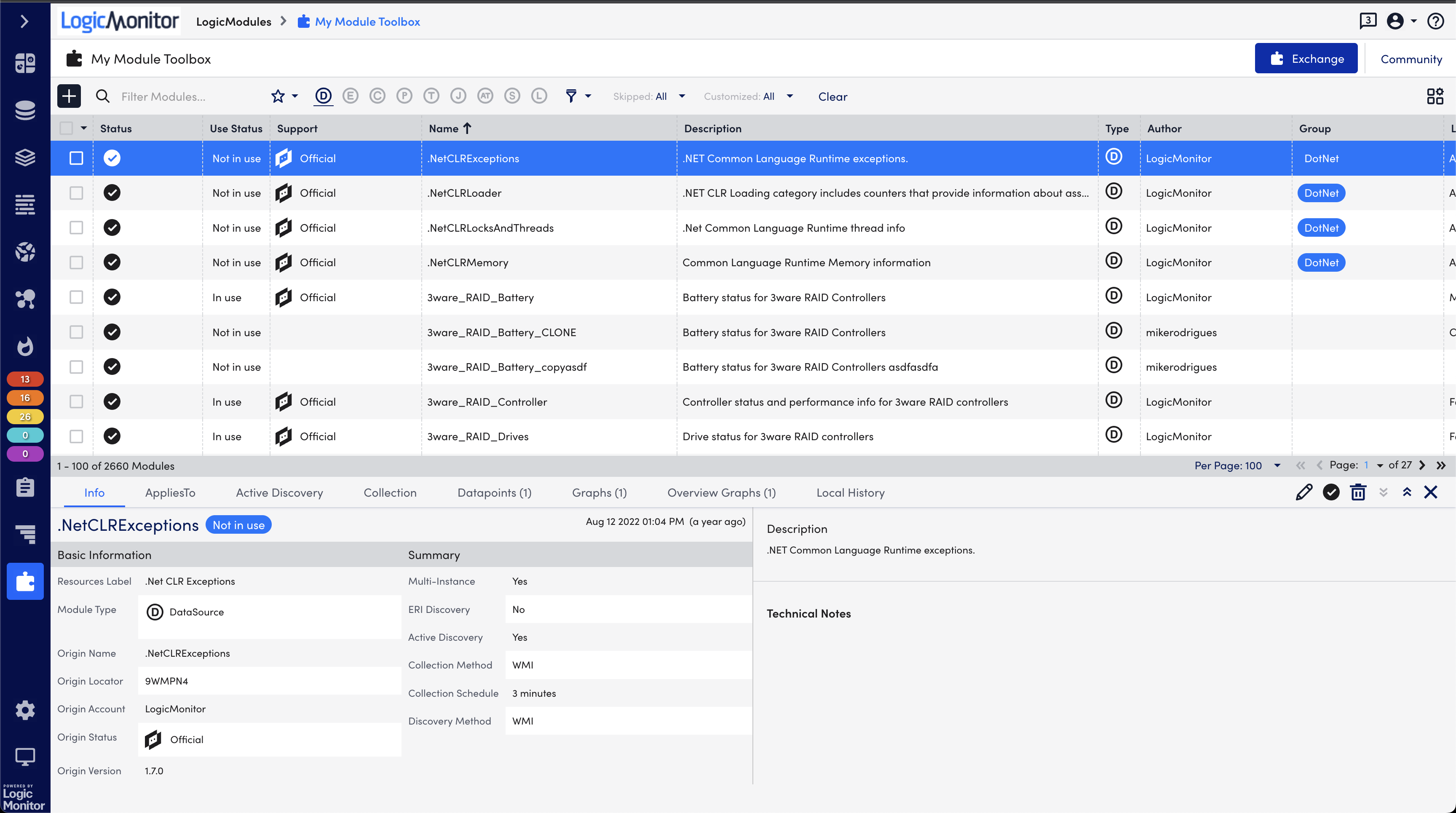
  • Both of these functions in UIv4 are pretty much in the same place they were in UIv3. Both clone and Show Associated Resources were within the full editor pages under Settings > Datasources > <Selected DataSource>. There is arguably an extra step since selecting an item in the Toolbox brings up the “detail pane” first, which does not allow edits, but I would say UIv3 didn’t have this equivalent. This is subject to change in the future, we created the detail pane so that we could ship Toolbox and Exchange and actually show module details before we had finished all of the editor work (which is/was a huge bucket of work)

    Where would you want to see these? On the detail pane?

    This is the detail pane view, for clarity:


  • The detail came about because we needed a way for people to see contents of the Exchange and Toolbox before we built out all the editors. The editors are much more complex and bespoke.

    We’ve considered enabling editing at the detail pane level but that isn’t set in stone yet.

  • Anonymous's avatar
    Anonymous

    Ah, there’s my confusion. I thought the save button was missing from the detail pane. Several parts of the detail pane are editable so i though the detail pane was the editor. Why isn’t the detail pane the editor?

    Yes, both those functions are non-editing functions so they should be on the details pane.

    UIv3 didn’t have a details pane and a separate editor, there was only the editor, which also served as the details pane. Now that the one thing is in both the editor and in the details pane, it would make more sense for non-editing actions (like the two mentioned) to be on the details pain.

    Ultimately, it would be better if the details pane was the editor. That way you’re not maintaining an editor UI, a details pane UI, and the comparitor/upgrade/difference UI. Just do the details pane and the comparitor.

  • Anonymous's avatar
    Anonymous

    Neither of those buttons is present for me where I expected them to be. Why would i need to be editing the module before i can clone it? Why would i want to be editing something i want to copy? The whole reason i’m copying it is because i don’t want to change the original.

    Same thing for the “show associated devices” action. It doesn’t make sense that it’s under the editor. It’s a similar action to running the applies to so it should be on the module level, not the editor.

  • Anonymous's avatar
    Anonymous

    Right. In the old UI, there was one place to view and edit. In the new UI, there is one place to view and another to edit. I get that you didn’t have the resources on hand to build out the editors in time for the toolbox release, so you had to take some shortcuts to get it released before the editors were ready.

    You can understand why there is confusion. Before, I would open the editor to view. In my mind, i was in view mode. I wasn’t changing anything. I was simply getting a view into what the module applied to and what instances it created. That’s why i expected this functionality to be in the details pane, where things are viewed. Also, since only the details pane existed for (more than?) a year, I didn’t even know the editors were there.

    Please get it set into stone. You don’t need to develop one set of code to view the fields and another to edit the fields. Especially since many other places in LM have little pencil icons all over the place for editing the fields.