Forum Discussion

Lewis_Beard's avatar
3 months ago
Solved

Graphs Device View vs Ovewview default?

As a portal admin on my site, I admit I very infrequently look at graphs tabs, I’m normally digging about in raw data or alert rules or datasource definitions etc.

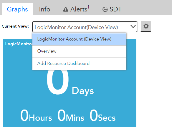
It was brought to my attention that a Customer is unhappy that when they go to their graphs tab, they get some device view by default, and not the overview. They hate having to switch it.

When did this start? I guess I should read the release notes closer.

Is there a way to change it back? Or are we stuck with the “Device” view being default?

  • This is one of the things that works better in UIv4. If you switch to UIv4, you should see the additional “resource dashboards” that were in the dropdown in UIv3 as tabs in UIv4. You can edit those resource dashboards (or delete them), specifying which graphs should appear and which devices the tab should be present for. It’s a good idea, and here’s why:

    If you go to the resource dashboard called (in your portal) “Overview”, you get the expandable list of datasources and you can expand the ones you want to see the graphs you want to see. What if you could make a separate tab that only had the important graphs on it and they were already expanded requiring no clicks? Need to see different sets of graphs depending on the type of device? No problem, setup a resource dashboard for each type and make sure the appliesto for that resource dashboard only shows up for its corresponding device type. That’s what resource dashboards are for and they’ve gotten a lot of attention in UIv4.

    Funny, in my portal I don’t have one called overview, but i do have “All Datasources” and “Host Status”. This difference may have something to do with when our portals were created (and i may have created the Host Status resource dashboard). In mine, UIv3’s “Device View” becomes the “Overview” tab in UIv4. 

    As an administrator, you have the ability to delete all the resource dashboards except the device view (uiv4 overview). There’s no option on the device view to auto-select all graphs. That’s a bummer, because being able to auto opt-in graphs to the device view would be the only thing that would make the device view usable. I guess the idea is that the overview resource dashboard should apply to all devices and only contain those widgets that are applicable across all devices. Unfortunately, in my case that makes the overview resource dashboard pretty much useless as we don’t have enough consistency across all devices to make any kind of singular overview resource dashboard. Some of our devices are ping only so no uptime, some are meraki networks that don’t have ping or uptime, some are API resources where we don’t care about the ping or the uptime.

    It would be different if there was a “properties list” widget where we could show a set of select properties and their values. Every device has properties that would be good to show on an overview of the device. @Sarah Luna I’m willing to sit down and explain this to your devs if you wanna have a call. Please grab some time on my calendar.

    I’m a little surprised anyone uses the graphs tab on the device level. Even in UIv3, it’s pretty tedious to get to what i want. It’s worse in UIv4. I normally find myself just navigating down to the datasource or instance under the device, then going to the graphs tab.

4 Replies

  • This is one of the things that works better in UIv4. If you switch to UIv4, you should see the additional “resource dashboards” that were in the dropdown in UIv3 as tabs in UIv4. You can edit those resource dashboards (or delete them), specifying which graphs should appear and which devices the tab should be present for. It’s a good idea, and here’s why:

    If you go to the resource dashboard called (in your portal) “Overview”, you get the expandable list of datasources and you can expand the ones you want to see the graphs you want to see. What if you could make a separate tab that only had the important graphs on it and they were already expanded requiring no clicks? Need to see different sets of graphs depending on the type of device? No problem, setup a resource dashboard for each type and make sure the appliesto for that resource dashboard only shows up for its corresponding device type. That’s what resource dashboards are for and they’ve gotten a lot of attention in UIv4.

    Funny, in my portal I don’t have one called overview, but i do have “All Datasources” and “Host Status”. This difference may have something to do with when our portals were created (and i may have created the Host Status resource dashboard). In mine, UIv3’s “Device View” becomes the “Overview” tab in UIv4. 

    As an administrator, you have the ability to delete all the resource dashboards except the device view (uiv4 overview). There’s no option on the device view to auto-select all graphs. That’s a bummer, because being able to auto opt-in graphs to the device view would be the only thing that would make the device view usable. I guess the idea is that the overview resource dashboard should apply to all devices and only contain those widgets that are applicable across all devices. Unfortunately, in my case that makes the overview resource dashboard pretty much useless as we don’t have enough consistency across all devices to make any kind of singular overview resource dashboard. Some of our devices are ping only so no uptime, some are meraki networks that don’t have ping or uptime, some are API resources where we don’t care about the ping or the uptime.

    It would be different if there was a “properties list” widget where we could show a set of select properties and their values. Every device has properties that would be good to show on an overview of the device. @Sarah Luna I’m willing to sit down and explain this to your devs if you wanna have a call. Please grab some time on my calendar.

    I’m a little surprised anyone uses the graphs tab on the device level. Even in UIv3, it’s pretty tedious to get to what i want. It’s worse in UIv4. I normally find myself just navigating down to the datasource or instance under the device, then going to the graphs tab.

  • This is in the old (preferred, IMO) UI. My “New UI Preview” is toggled OFF.

    And yet at some point we got a new dropdown that has a device view or an overview view, and device is default, and a user noticed it. Its pretty frustrating.

    So I’m using the old UI, but on the graphs page this weird choice of Device View vs Overview is here. I dont ever remember seeing this, and neither do the users. Not sure if it came with a recent update. The default Device View graph has nothing on it. The Overview has to be selected, and it actually has the graphs that people expect, and used to get by default.