Forum Discussion
10 Replies
- Kwame_A
LM Conqueror
I hear you
@ldoodle Did you submit product feedback requesting a feature for an Alert List Dashboard?
- Anonymous
How did you word it, so others can copy/paste into the fr form?
- Kwame_A
LM Conqueror
@ldoodle Yes,
@Mike Moniz is correct.Testing this in my own LM Portal I was able to resize the widget by dragging out the bottom right corner. I think you need to expand your widget downwards.
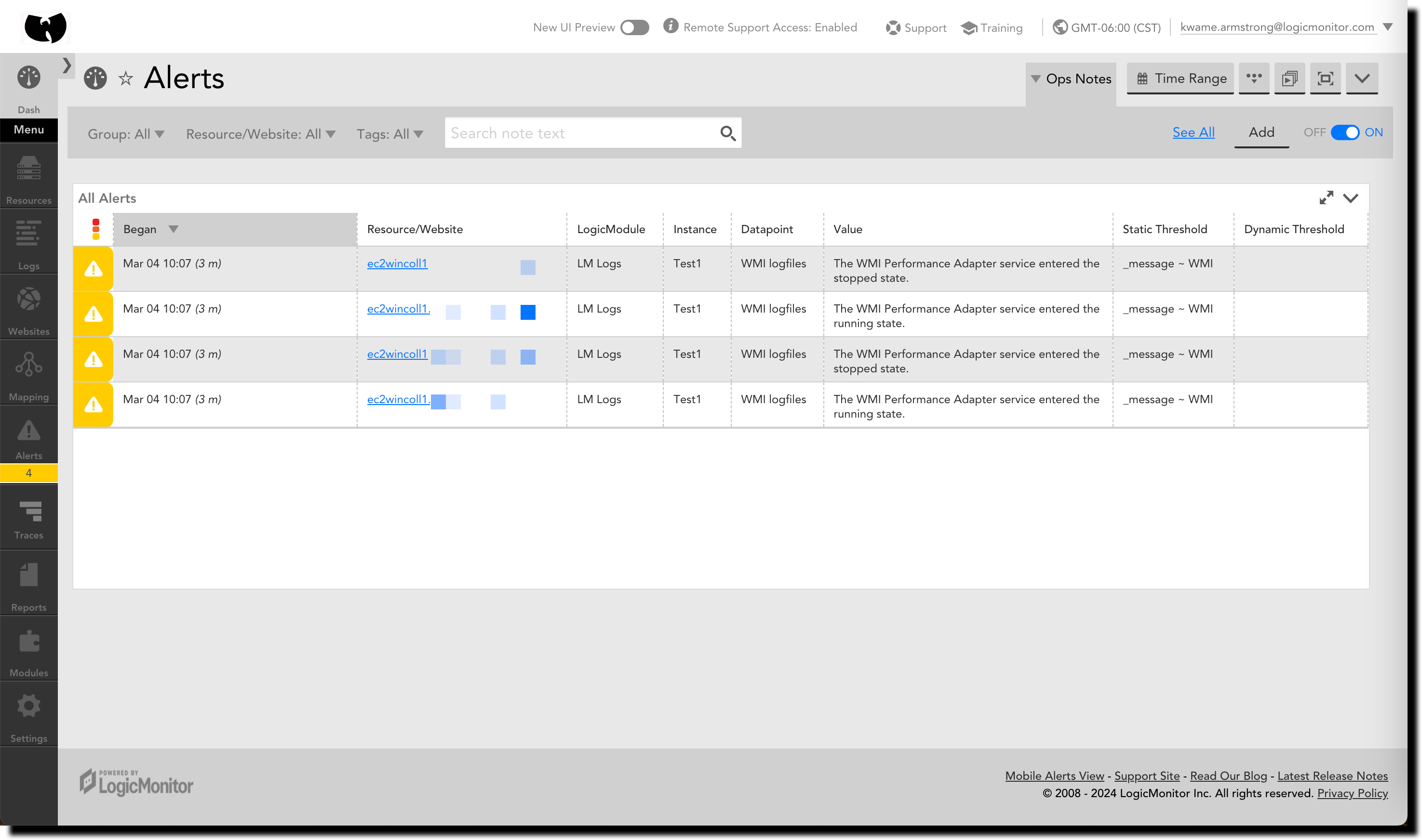
No scroll bars, at all.
- Anonymous
Yeah, double scrollbars suck.
- Mike_Moniz
Professor
You should be able to resize the alert widget to keep it contained within one screen, preventing the outermost scrollbar.
- ldoodle
Advisor
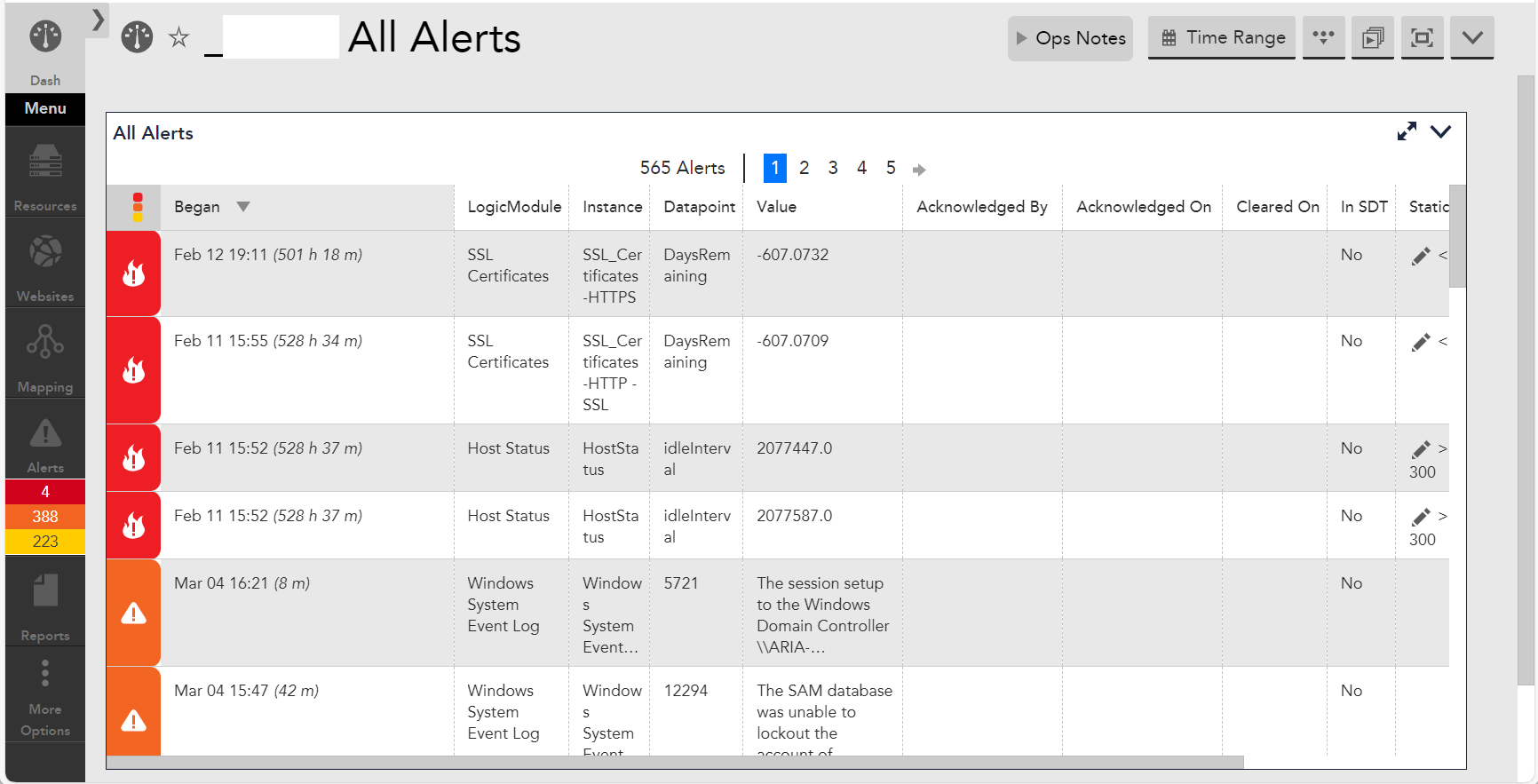
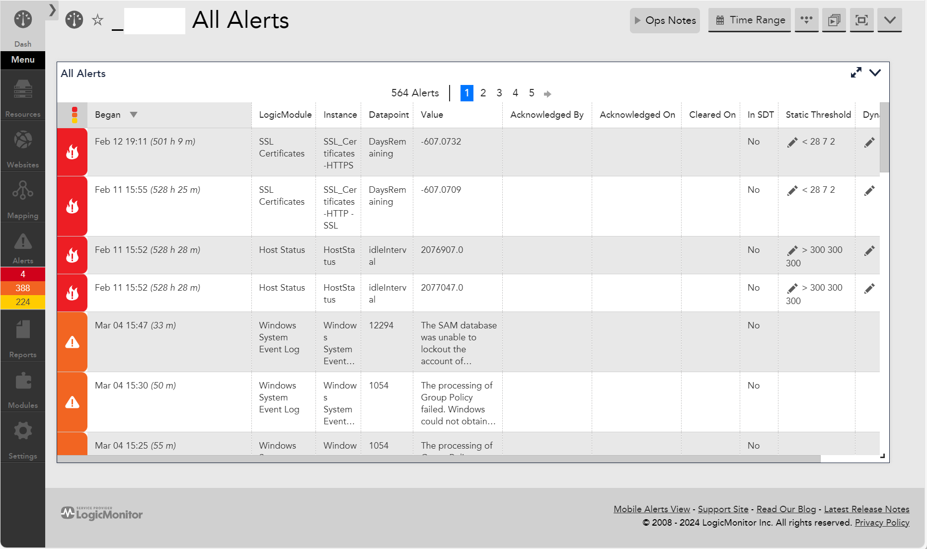
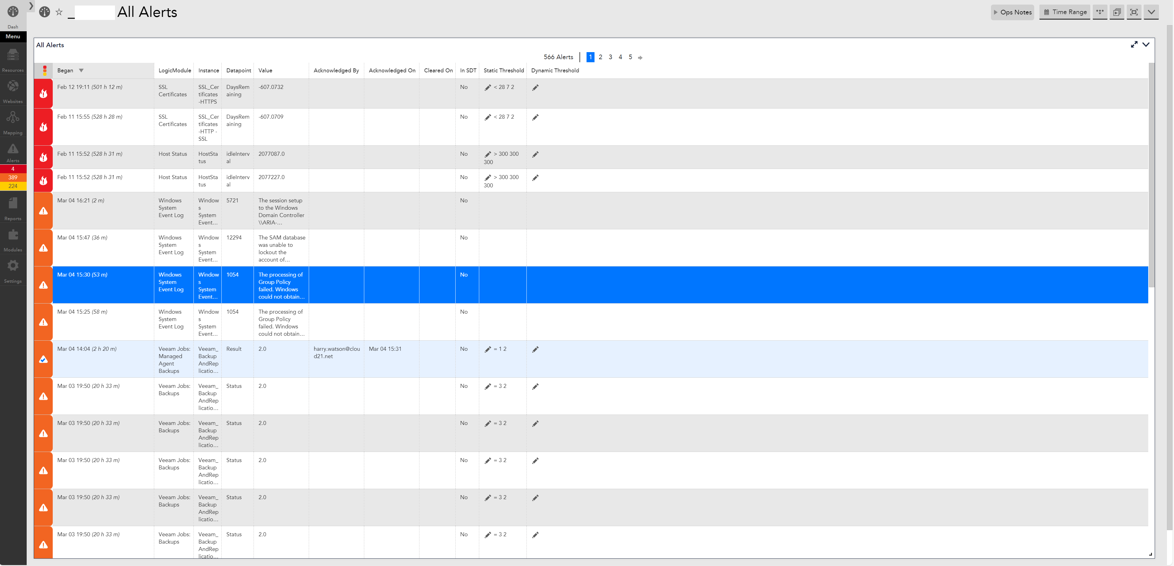
Yeah of course I know you can do that, but the way the scaling of widgets works is not very sensible. e.g. you have to size the widget to the exact browser window size. And when you drag the browser window bigger or smaller you either end up with space at the bottom, or double scrollbars.
This example shows 1 windowed mode okay, 1 windowed mode and 1 maximised the browser scroll bar is back…
- ldoodle
Advisor
I haven’t yet, but I am planning to. I like to post here first so I can link to it in the FR form.
I may even change the FR to something around better widget scaling (which I think is needed generally) - as this would achieve the same outcome without having to build a whole new Dashboard type/process.
I mean this example looks absolutely fine in windowed mode (pic1), but seems a massive waste of space in maximized mode (pic2). To the point you see less widgets in maximized mode because it scales them far too much!
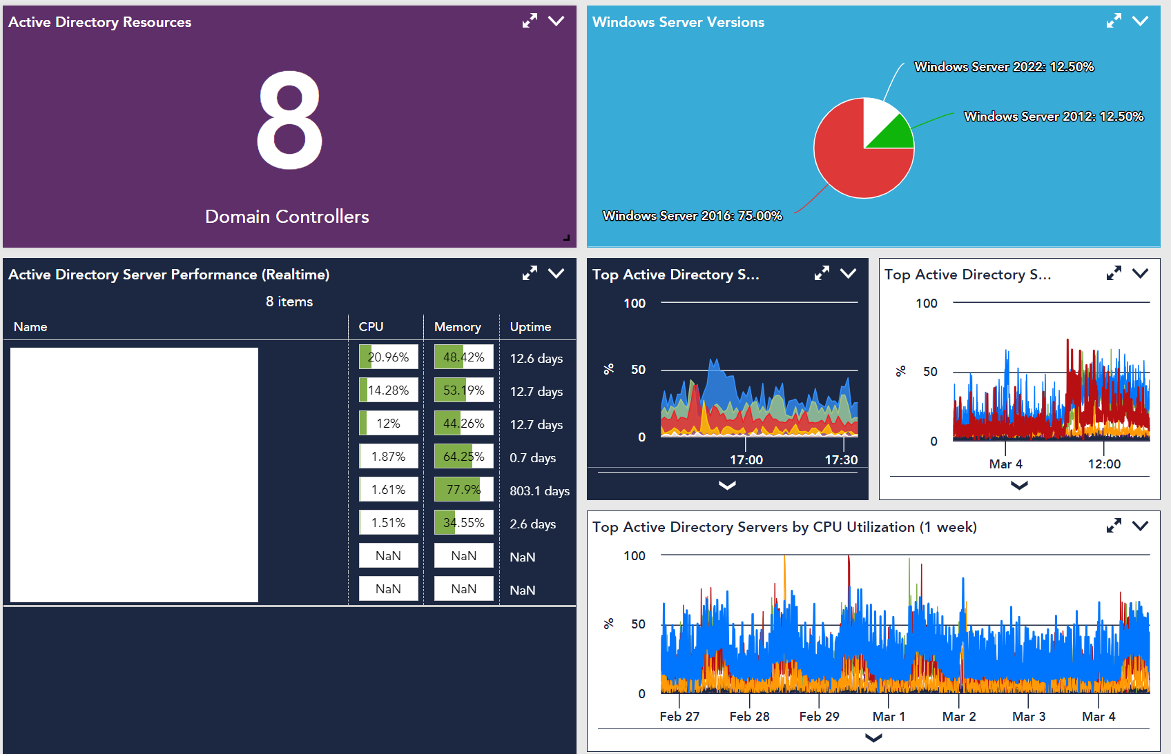
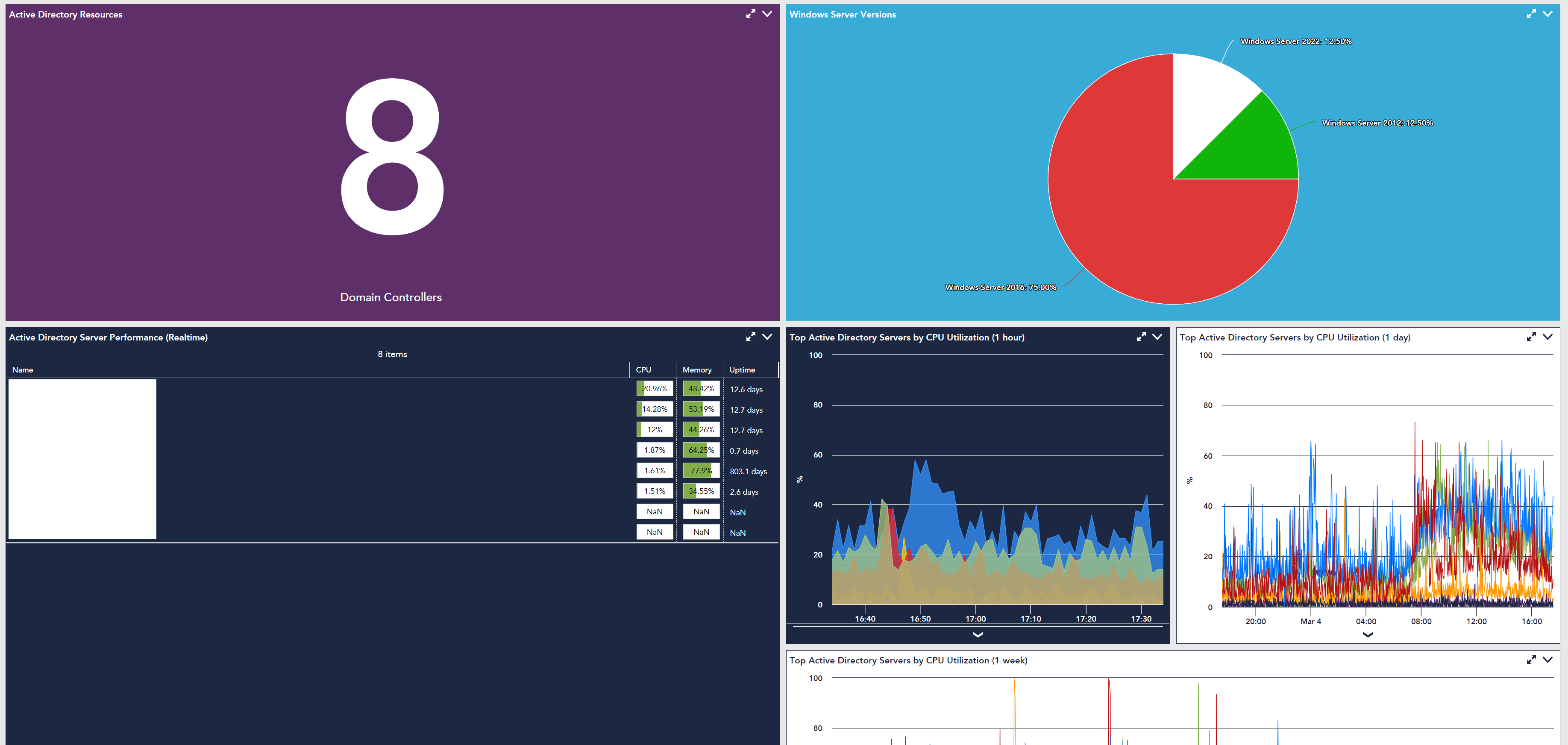
- ldoodle
Advisor
Here’s a better example...
Specific size windowed mode - looks lovely:
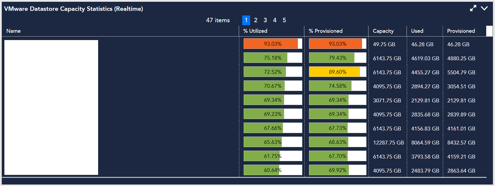
Maximized mode - what’s all that blank space at the bottom for?!!!:
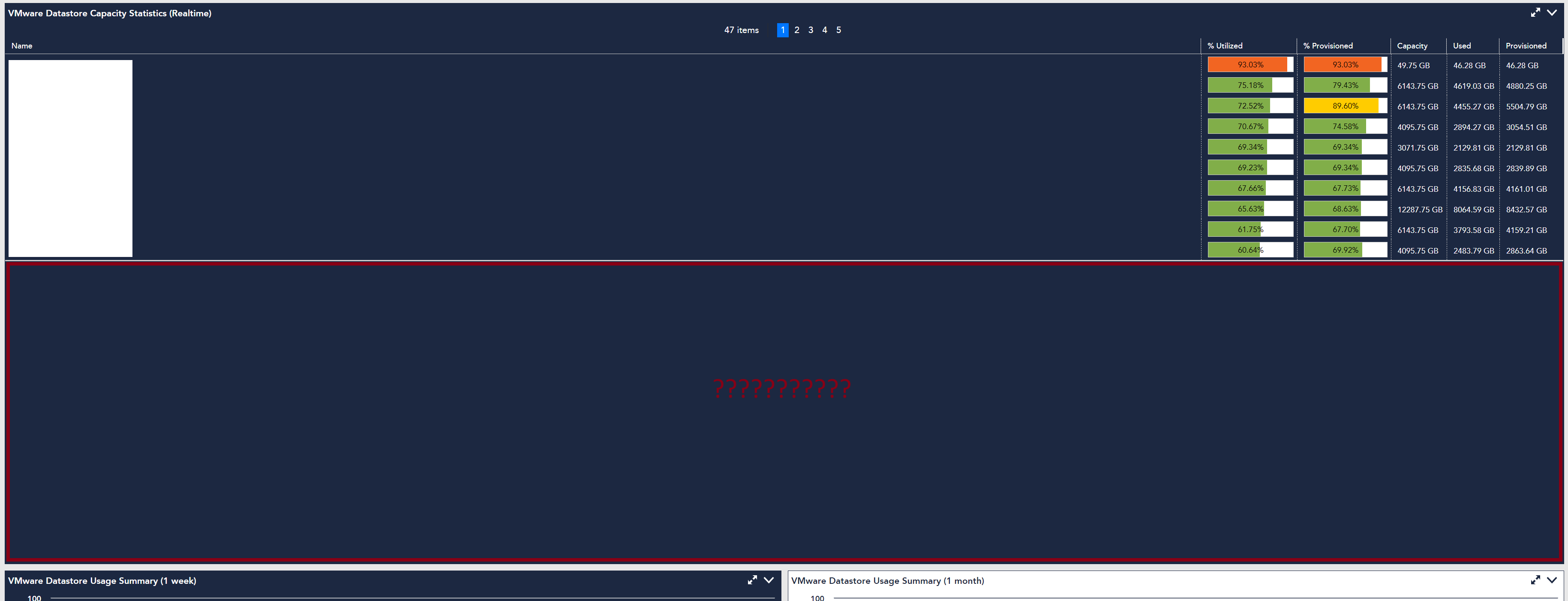
In this 2nd pic I’ve intentionally included the widgets below to really highlight the issue.
If the widgets scale that much, the ‘Results Per Page’ setting needs to be dynamic to also expand and contract with the widget.
- ldoodle
Advisor
I hear you
@ldoodle Did you submit product feedback requesting a feature for an Alert List Dashboard?
Feedback submitted, with a link back to this post.
- ldoodle
Advisor
bugger I forgot to copy it here.
@Kwame A is it possible for LM to post my FR content here for others? If so I’ll DM you my LM login email address it would have come from.
