Forum Discussion
 Professor
Minimum widget size is great increased in v4 reducing data density. My at-a-glance dashboards now require scrolling. Horizontally, it’s slightly increased, Vertically, I’ve lost an entire row of widgets.
Big number padding also reduces the visibility of the Big Number in the overall view, I definitely agree with Stuart here.
Criticality is present in an alerts widget in v3, missing in v4.
NOC widget vertical justification is a bit weird. I have a series of them across the top of a dash or different devices types, and some have 1, 2, or 3 devices in them… they spread vertically rather than stacking from the top down directly. It’s visually very odd. I’d post screenshots, but they contain client info that I can’t share publicly (dashboard 2366).
Loadtimes and scrolling is slow as with the rest of v4, I assume that will be worked out before release.
I have to play with custom builds within the widgets yet, this was all based on the primary dashboard we use to view client environments at a glance for faster general troubleshooting (Specific Purpose: Support MTTR reduction).
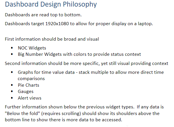
I’m excited to see this progress. In terms of layout that I’m using to evaluate the changes, this is our design guide - some of the changes make the Initial Broad/Visual pieces disappear into the rest of the dashboard (Widget Space larger, inner elements smaller):

Recent Discussions
- 2 years agoAnonymous
