Forum Discussion

  • yep, the alerts page -good!

    but there is more!

    Personally I’m often confused while applying scheduled SDT and in general - we have a huge resource tree and kinda of established process flow, internal documentation so .. please make it 24 hours in old good UI 

    Thanks!

  • btw, pls let me kindly know, is tehre an ETA for a new UI complete rollout?

  • mray's avatar
    mray
    Icon for LM Conqueror rankLM Conqueror

    LOL @Stuart Weenig 

    I don’t have all the details by any means, but I can say that the Resources page and Reports page are next up to roll out as a beta. If have a Customer Success Manager, ask them for more deets!

  • I’m sorry, but you are pointing me out to an archived and a bit outdated thread, which i was mentioning as a reference.

    Where should i request such a simple and clear feature like UI ability to display time 24 hour format?

    Thank you!

  • Anonymous's avatar
    Anonymous

    btw, pls let me kindly know, is tehre an ETA for a new UI complete rollout?

    haha, you’re funny

  • Sarah_Luna's avatar
    Sarah_Luna
    Icon for Product Manager rankProduct Manager

    Just to clarify - are you talking about 24 hour format in the custom time range picker as well?

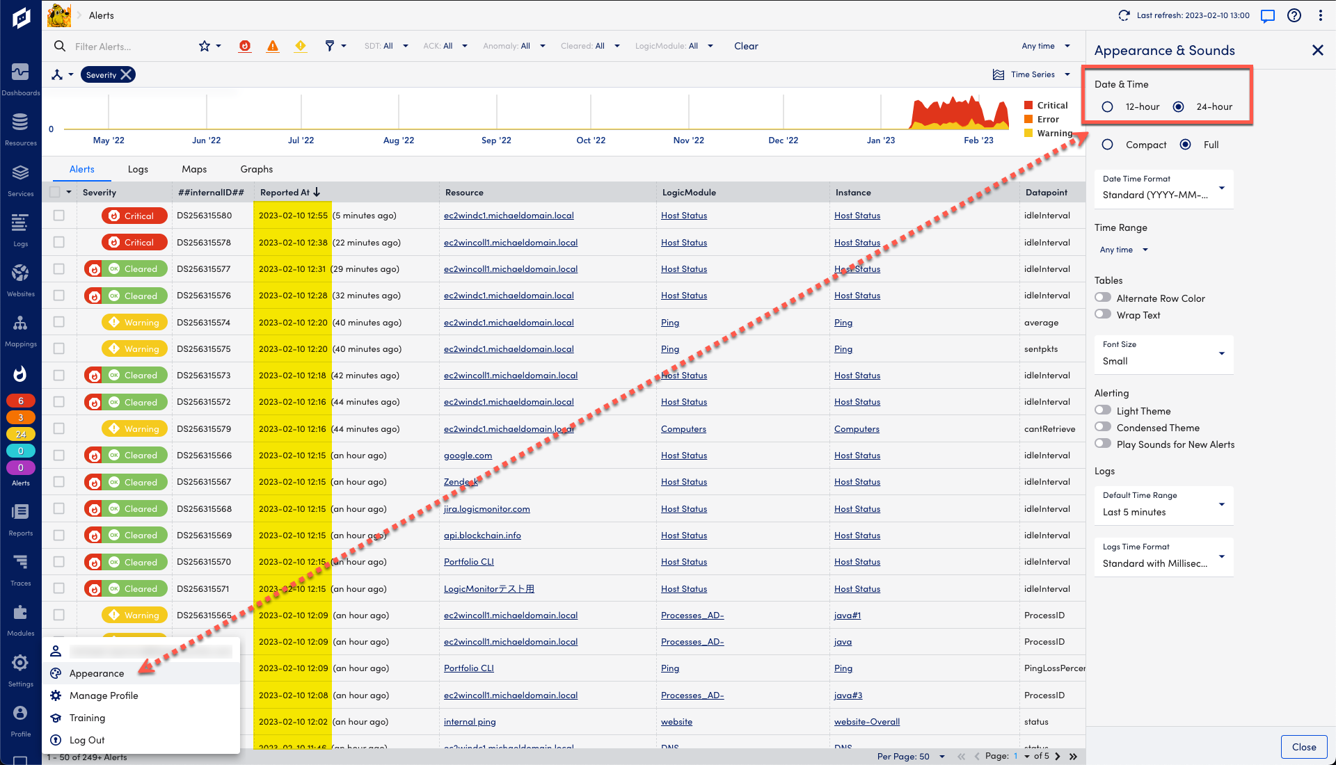
    In the new UI, we do have components that use the 24-hour format (like on the Alerts tab, Graphs, and the page-level time picker that’s in the top right of the screen)

    but some components still use the 12-hour format - like in the below screenshot. Is this what you’re referring to?