Having this built in would be awesome.
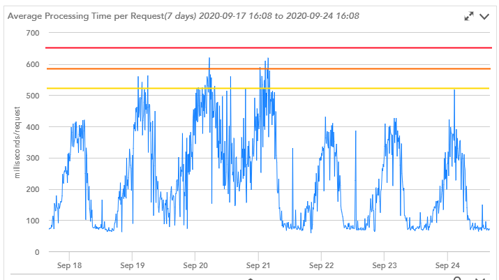
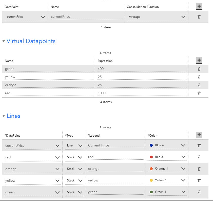
That said, if the thresholds are simple enough (static and global), you can do this on graphs (not overview graphs). Let's start by setting up the example. Looks like the thresholds you have are around 510, 590 and 650. You can add virtual datapoints to the graph with values of 510, 590, and 650. At this point, you have two options. To get what you've shown in your screenshot, you'd just plot each of these three lines with their corresponding colors.
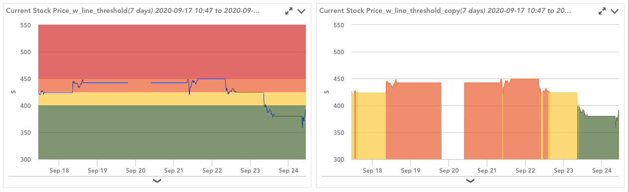
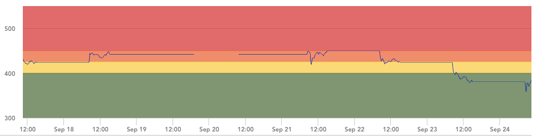
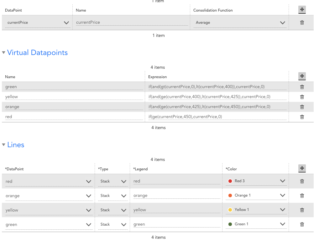
However, I like a different approach. Instead of plotting them as lines, I like to plot them as "Stacked".
Limitations (reasons why this should be built in):
1. only works on graphs, not overview graphs (applies to both lines and stacked)
2. you have to manually set the thresholds in the graph config (applies to both lines and stacked)
3. You can only paint the graph one way. If you have thresholds that vary by group/device/instance, this pretty much won't work. (applies to both lines and stacked)
4. You may have to statically set the max value in order to ensure that the entire top portion of the graph background is painted red. I set the value to 1000, meaning 1000 above the top of the orange, which is 25 above the top of the yellow, which is 25 above the top of the green, which is 400 above 0. If you don't set the max value, the widget will try to include the top of the red on the graph. (only applies to stacked)
5. Ordering of the ranges is based on when they are added. Add the data first, then add the red, then orange, then yellow, then green. (not really an issue with lines, only with stacked)
6. Depending on what you mouse over, it can sometimes be hard to see the plotted data (because the widget is trying to highlight what you are mousing over, if you mouseover the painted range, it tries to highlight it for you, which can sometimes hide the data you are actually interested in). (not really an issue with lines, only stacked)
There might be a few more drawbacks, but this is a method i was playing with a while back that seemed to work.
Another option would be to create 4 virtual datapoints that compare the value of the datapoint to the threshold (limitations #1-#3 still apply). You'd have then 5 columns:
raw value, value if in green range, value if in yellow range, value if in orange range, value if in red range.
If the value wasn't in the particular range, the complex datapoint should return a 0. You would then plot everything except the raw value as stacked"
This one overcomes limitation 4 and 6 above.