Discrimination against people with colour blindness
Hello
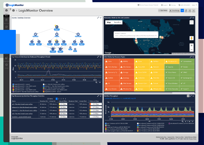
I have recently started to use LogicMonitor and I am very disappointed with colour scheme you use for alerting. All the alert symbols are identical; a white triangle with an exclamation mark on a coloured background. The only difference is the colour of the background and all the colours are taken from the part of the spectrum where people with red/green colour blindness can't tell colours apart.
This means that you are not serving 8% of your users properly!!
Can I suggest you use different symbols as well as different colours to tell the various alert levels apart? I can think of several ways you could improve the symbology - Perhaps have more exclamation marks the more severe the alert is? Perhaps an asterix for the highest alert?
I'll add the screen capture from the home screen of your own webpage - it shows the problem front and centre on your doorstep!!!