Could we improve the Services icon in new UI?
In the old UI, the icon for folder is pretty easily identified.

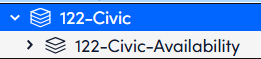
In the new UI, the icons are very similar - This is just missing the sides

Ryan Gillan
Posted 1 year ago·Last reply 1 year ago
1 comment
In the old UI, the icon for folder is pretty easily identified.
In the new UI, the icons are very similar - This is just missing the sides
David Marsh
·1 year agoUsing a folder icon to represent a group of items has been a UI paradigm since the Xerox Alto.
Agree that having such a similar icon and colour is confusing, especially when they're are quite small on the screen.